


OECD
canada


The OECD commissioned us to develop a case study that visually represents inclusion as a core value. Canada was selected as the focus country, requiring a bilingual integration of French and English within the overall design system.
The objective was to create a bold, immersive environment that translated an abstract principle into a tangible spatial experience.


Concept
The concept centered on the circle as a universal symbol of inclusion. Its infinite, borderless form represents a space where no one is excluded and everyone belongs.
By bringing together circles of varying diameters, colors, strokes, and fills, we visualized diversity not as separation but as convergence. The overlapping forms created a unified whole—symbolizing how individuality and collective strength coexist and reinforce one another.


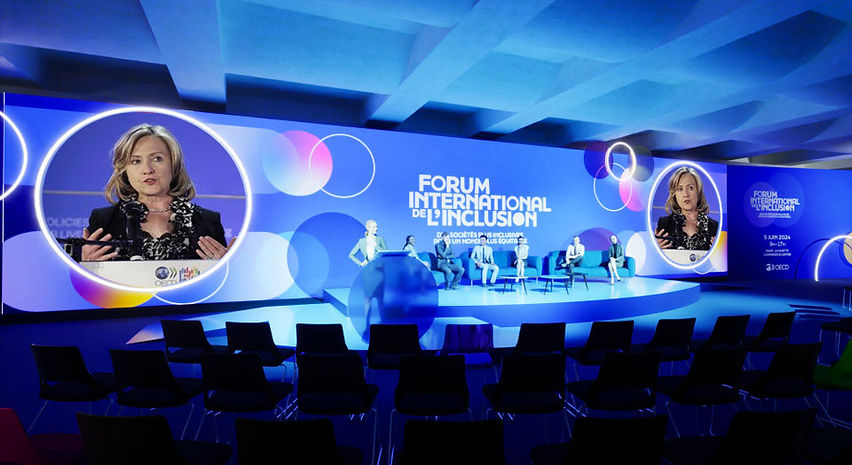

Design
The artistic direction translated the circular concept into a multi-layered spatial experience. Materials, color gradients, and dimensional depth were carefully orchestrated to create movement and visual rhythm across the stage and surrounding environment.
Layered circular elements interacted with light and shadow, forming a dynamic composition that felt both structured and fluid. The bilingual integration was seamlessly embedded within the design system, ensuring clarity while maintaining visual harmony.
The result was an immersive scenography that turned a conceptual idea—inclusion, into a physical, experiential space.


Result
The activation successfully transformed a theoretical value into a compelling visual narrative. Through strong symbolism and cohesive execution, the environment communicated inclusion in an immediate and intuitive way—engaging audiences both emotionally and intellectually while reinforcing the OECD’s message at scale.
